Meet the Roster: Chloe Lukas

Vibrant, whimsical, compelling, and quietly obsessed with turning the ordinary into something you can’t stop looking at.

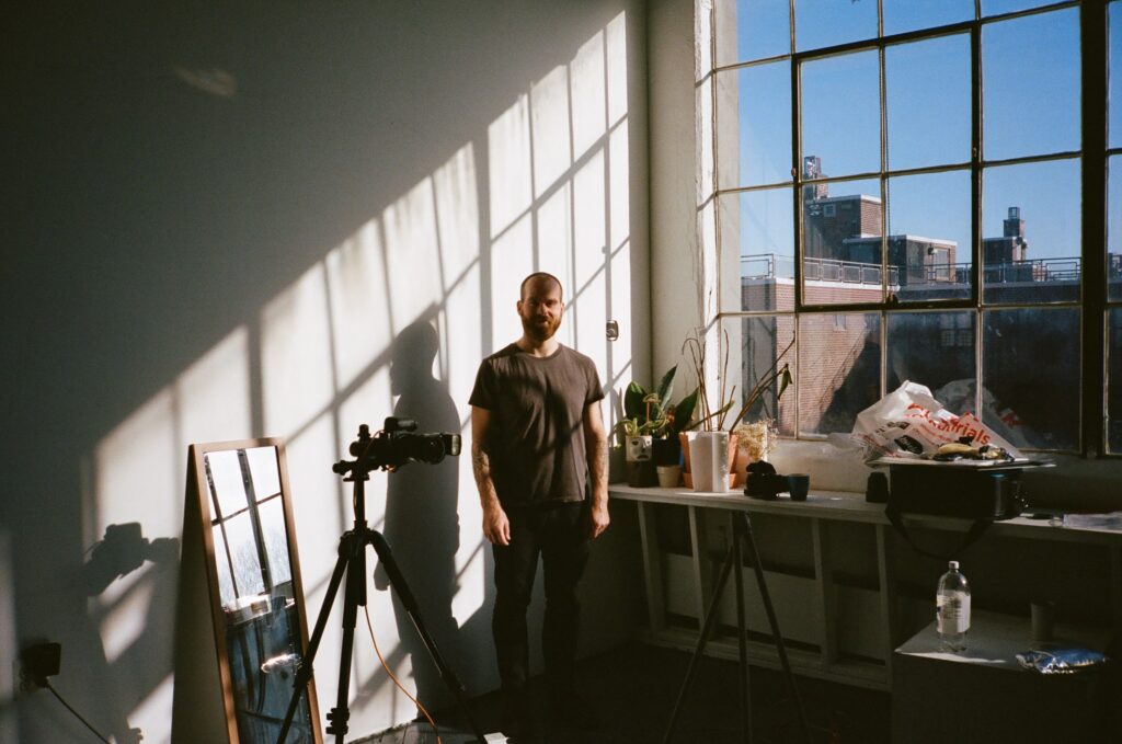
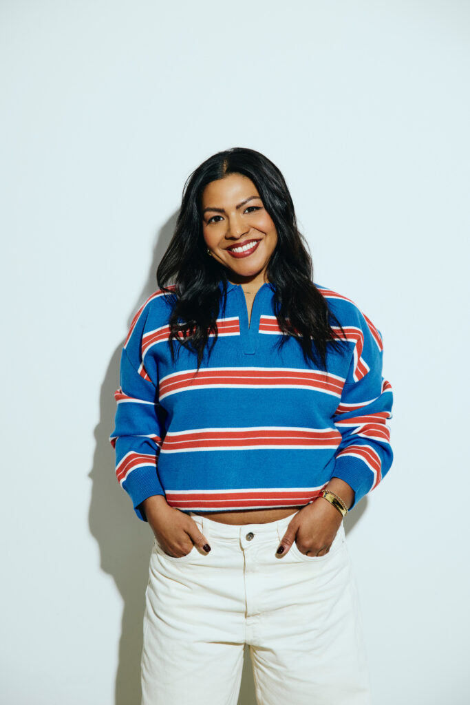
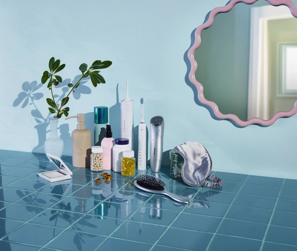
Chloe Lukas is Toronto-based, but her eye is always in motion. She shoots across product, lifestyle, food, and fashion, and her work has a signature quality that’s hard to fake: colour that feels intentional, moments that feel present, and images that don’t look overworked even when the craft is doing a lot.

Skincare and wellness product still life on glossy blue tile with electric toothbrush, water flosser, supplements, hairbrush, satin sleep mask, plant, and wavy mirror.


If you’ve ever wondered what separates a nice photo from an image that actually sticks, Chloe has a simple answer. It’s not the object. It’s the feeling you manage to pull out of it.

“I’m always chasing beauty. The kind that can transform something seemingly ordinary into something evocative and captivating.”

We want to introduce Chloe in her own words, highlight notes on what she’s chasing, and how she gets her work to shine:

The Chloe Lukas Quick-Fire

Where are you based?

Toronto.

What do you want to be hired for most right now?

Product, lifestyle, food, fashion. The list could go on because I want to shoot it all.

Three words that describe your work?

Vibrant, whimsical, compelling.

Colorful still life scene with coffee cups, citrus fruit, lime slices and flowers on a bright tiled kitchen table

What are you always chasing in an image?

Beauty that transforms something ordinary into something evocative and captivating. What excites me most is the exploration itself. Through collaboration with a creative team, I love uncovering unexpected details, moods, and moments.

What do you do to keep the work feeling human, not overworked?

I’m drawn to work that still carries a sense of spontaneity, where the viewer can feel the presence of the people, the setting, and the moment itself.

Describe a photo you’re proud of. What makes it work beyond “it looks good”?

An image I’m especially proud of comes from my Demure series. It was captured during an emotionally difficult time for my family. At golden hour, we walked through my aunt’s fields, attempting to soften the heaviness we were carrying. This image is a testament to the deep connection I share with my family and to their generosity in supporting my art, even in moments of vulnerability. It represents not only grief, but also tenderness, trust, and the quiet act of being held by both nature and the people around us. It will always remain one of my proudest moments as a photographer.

Chloe Lukas subject in a pale blue dress lying in tall green grass at golden hour, lifestyle editorial photography

What inspires you outside of photography?

Nature, everyday life, and the people around me. A lot of it comes from simply observing the world we live in: light changing through the day, quiet moments, loud moments, conversations, movement, stillness, emotion. My inspiration comes from real life experiences, travel, relationships, and the small details people often overlook.

What do you hope someone feels when they see your work?

I want my work to slow the viewer down for a moment. I want to make them feel nostalgic, intrigued, comforted, excited, or even puzzled. I strive to create imagery that’s visually striking; work that captures attention, reinforces brand identity, and leaves a lasting impression. I also hope my work feels human and not overly perfected, but rather honest and grounded. Even in commercial work, I think people connect most with imagery that feels real.

Pilot Coffee Roasters “Ruby” coffee bag styled in a bold red and blue set with translucent red panels and citrus peel props.

Your go-to reset when you’re stuck?

Visiting my Oma and Opa. They have a way of slowing the world down for me and always bring a sense of ease, understanding, and support. That said, these ninety-eight-year-olds have surprisingly busy social schedules, so my backup options are camping or heading to the beach. From fall through spring, you can usually find me at the pool, on a ski hill, or somewhere crafting.

What we love about Chloe’s approach

A lot of photographers can make something look good. Chloe is more interested in making it feel like something. Her answers all point to the same thing: she’s not chasing polish for polish’s sake. She’s chasing presence. Whether it’s a product set, a lifestyle moment, or a fashion frame, she’s looking for the small cues that make an image believable.

Chloe Lukas makes vibrant, whimsical images that still feel grounded in real life, even when the concept is elevated.

Want to see more? Explore Chloe’s work on her United Assembly roster page, and keep an eye out for upcoming features and new work drops.

Explore Chloe Lukas’s work on the UA roster and inquire for availability. For more from Chloe, check out her features on the UA Instagram or follow her directly on Instagram for the latest.

United Assembly, Reintroduced

Do Good Work.

If you’re familiar with United Assembly, you already know the vibe: calm sets, clear communication, and great work delivered properly. If you’re new here, welcome. This is our rebrand; a sharpened version of what’s been true from day one.

United Assembly started five years ago in a moment that didn’t feel “perfect” at all. I was working at another agency when the owner decided to close. Overnight, the future went fuzzy. With encouragement and support from that same owner, I made the call to start my own agency and give it a real shot.

The first year? “Scary, uncertain, yet exciting.” I launched during COVID, when everything felt like a question mark and everyone was figuring it out in real time. My sink-or-swim mindset with the momentum and relationships I’d already built, helped UA hit the ground running and kept showing up, even when the industry was shifting under everyone’s feet.

One early moment made it click: shortly after UA formally launched, a large client requested a quote on a project. Negotiations, budget sign-off, the whole thing. That moment of “Wow, this is really happening on my own!” is still a defining memory.

That’s the spirit that built UA: No hype or noise. Consistency. Taste. Follow-through. With genuine love for the people behind the work.

Why now?

To put it plainly: The brand presence did not match the experience.

People were familiar with UA. People had worked with UA. But there was a disconnect between the quality of our work and UA’s visibility online and elsewhere.

The goal of our rebrand is alignment. A more impactful and cohesive identity across all platforms. A website that gives a clearer message about how we work and what we offer. A space that gives our roster the spotlight they deserve.

The first 10 seconds on our new site should tell you this: Our main focus is execution, with transparency and consistency throughout the production process. That is what we are known for and is the foundation of UA’s evolution.

What changed?

You’ll feel the change right away: Our logo is bolder. Our voice is clearer. Our online presence reimagined, placing the work center stage where it ought to be.

But what we’re most proud of is something less visual and more foundational: the language. We’re keeping it simple. No fluff. No smoke and mirrors. Our rebrand makes it clear, UA stands behind what we put out into the world and we are serious about how we run projects.

This matters more than ever because the industry has changed. Budgets are shrinking while expectations remain high. The only way to protect the work is to find the balance between delivering a great end product and being realistic about what’s possible.

UA is built for that reality. We make things clear early, so projects run smoothly later. Our goal is not just beautiful work, but also an enjoyable process that people want to repeat.

What this means for artists

United Assembly is a representation model rooted in relationships. Our rebrand is meant to unlock more visibility for the artists we represent, and in turn, more opportunities.

Our aim is that clients search for us across platforms and immediately see consistency. Our work looks cohesive. Our roster feels intentional. Our presence is strong enough that it creates momentum, not just recognition.

But visibility is not the only thing that matters. Representation only works when it’s built on trust. For UA, the most important thing is that our artists feel supported and heard. Trust and transparency are non-negotiable. That is the foundation of a successful artist-rep relationship and remains the basis of how UA operates.

Word of mouth will always be powerful and is still one-way projects come in. However, the industry isn’t local anymore; brands and agencies move globally, teams are distributed. Having a consistent online presence gives potential clients a clearer glimpse into what we offer and our artists a stronger platform that travels.

What this means for clients

If you’ve been on the brand side, you know that production stress rarely comes from one big dramatic issue. It usually comes from smaller misalignments stacking up.

UA solve manage our client’s stress with a “no-surprises” attitude to production. Sure, unforeseen elements always happen. Weather changes. Products arrive late. Locations throw curveballs. But our job is to have hard conversations early, so you are not dealing with them when time and money are most critical.

We operate with the big picture in mind, and we try to get ahead of issues before they become problems. That’s how UA protects the creative and keep the process calm.

UA Reps are there to facilitate details and be a constant point of contact for both the artist and the client. That means fewer dropped threads, faster decisions, cleaner approvals, and a smoother day for everyone. It also means the artist can stay focused on what they do best, instead of juggling admin while also trying to deliver at the highest level.

As UA grows, our focus is also expanding beyond local work. Brands shoot everywhere and agencies operate across time zones. We are pushing ourselves to expand our network internationally with globally used campaigns in both stills and motion.

UA and our artists thrive on creative collaboration with clients, the freedom and trust to explore possibilities together is a powerful process.

A new age for UA

This rebrand is not just a visual update, we are entering a new era with greater clarity and intention. UA is a place for people to gather and enjoy the process leading up to the shoot, as well as the shoot itself. Same message, just with a bolder appearance.

Over the next little while, you’ll see us show up more consistently. Not louder just more present.

Here’s what to watch for:

  • Greater engagement and more behind-the-scenes insight into how projects come together
  • A blog built for creatives and brands, with helpful quick reads
  • A newsletter that keeps you in the loop on roster updates, projects, and what we’re tracking in visual culture
  • Increased visibility for our artists through features, spotlights, and storytelling that gives context to the work

This new era for UA has been a long time in the making, seeing it out in the world is extremely exciting and rewarding.

Who the new UA is for

The new UA is for people who want to work with a company that believes in fairness and executing to the highest ability.

If you’re a creative, we’re here to advocate for your work, protect your time, and help you show up in the right lane with clarity.

If you’re a brand, agency, or design team, we’re here to make production feel steady. We’ll help you match the right talent, lock the details early, and deliver exceptional work that feels human, intentional, and properly handled.

If you’re building something and you want to do it right, we’d love to hear what you’re making.

Do Good Work. We’ll handle the rest.
Lindsey & the UA team

Licensing 101: A Beginner’s Guide to Using Photos Legally (Without Getting Burned)

If you’ve never dealt with licensing before, here’s the simplest way to think about it: buying a photo is not the same as owning it.

In most commercial photography, the artist keeps ownership, and the client purchases a license (permission) to use the images in specific ways. This guide breaks down the basics for both clients and artists in plain language.

1) What is licensing (and why does it exist)?

A license is a written permission that answers one question: “How can these images be used?”
It protects both sides:

  • Clients get clarity (no surprises, no takedown requests, no awkward “are we allowed?” moments).
  • Artists protect their work from being used beyond what was agreed (especially when images end up in ads, new markets, or evergreen brand libraries).

Think of it like renting a space: you can use it, but you don’t automatically own it forever.

2) Ownership vs. usage rights (the one thing people mix up)

Here’s the core difference:

  • Copyright / ownership: who legally owns the images (usually the photographer/artist).
  • Usage rights / licensing: what the client is allowed to do with the images.

Most of the time, brands are not buying “the photo forever,” they’re buying permission to use it for a specific purpose.

Exception: Sometimes a contract is work-for-hire or includes a full buyout (ownership transfers or usage is extremely broad). That can be valid but it should be explicit, and it usually costs more because the artist is giving up long-term value.

3) The 5 licensing basics (with simple examples)

If you’re new, these are the five terms that matter most:

Usage (where it will appear)
Example: “Instagram + website” is different from “paid ads + billboards + retail displays.”
Wider usage = more value = usually higher licensing fee.

Duration (how long you can use it)
Example: 3 months vs 12 months vs “in perpetuity” (forever).
Longer duration usually costs more because the images keep working for the brand.

Territory (where you can use it)
Example: Canada-only vs North America vs global.
More territory = more audience = more value.

Exclusivity (does the artist have to avoid competitors?)
Example: A skincare brand may want the images (or the artist) not used by another skincare brand for 6–12 months.
Exclusivity can be powerful, but it must be clearly defined.

Deliverables (what you actually receive)
Example: “15 final selects + 5 crops + 2 cutdowns” vs “all raws.”
If it’s not written down, expectations drift.

Conclusion

Licensing is not red tape, it’s what turns creative into clean business. When usage, duration, and territory are clear, projects run smoother, budgets make sense, and the relationship stays healthy. Whether you’re the client or the artist, the goal is the same: clarity upfront so everyone can focus on making great work.

Not sure what terms you need? We can help you scope licensing and usage before shoot day so there are no surprises later.

The 10-Minute Pre-Production Checklist That Saves a Shoot

Most production issues don’t begin on set. They begin in the brief, the timeline, or the tiny decisions that get postponed until they become expensive. If you want a shoot day that feels calm (and results that feel intentional), this is the 10-minute checklist we run before the cameras come out.

1) Lock the “why” before the “what”

Before you talk lighting or references, lock the purpose. “We need content” isn’t a goal. “We need six images for paid social plus one hero for web by Friday” is. When the goal is clear, every creative choice becomes easier: you know what the images should feel like, what they need to do, and what decisions matter most.

2) Define deliverables and usage like you mean it

Deliverables aren’t just a number. They’re formats, crops, timelines, and expectations. And usage matters because it shapes everything from scope to licensing to approvals. Organic social for two weeks is not the same as a paid campaign across multiple markets for a year. When usage is fuzzy, budgets get messy and timelines get tight. Clarity keeps the relationship clean.

3) Run the checklist that prevents chaos

Here’s the part that saves the day:

  • Post plan (delivery, revisions, versioning)
  • Goal (one sentence) + what the work should feel like
  • Deliverables (counts + formats + deadlines)
  • Usage (channels + paid/organic + territory + duration)
  • References (6–10 images + what you’re taking from each)
  • Approvals (day-to-day + final decision maker)
  • Schedule (call time, key setups, breaks, wrap + buffer)
  • Location realities (access, power, restrictions, weather backup)
  • Product/props/wardrobe (confirm arrivals + backups)
  • Shot list (must-haves vs nice-to-haves)

Conclusion

The best shoots feel effortless because the chaos was removed early. Ten minutes of clear planning protects the creative, the budget, and the people doing the work. Calm isn’t luck, it’s pre-pro.

Have a project coming up? Inquire with UA to align the right talent and build a production plan that stays calm from brief to delivery.